Design

UX and UI design

Interfaces people can use without being trained. The useful first question is not what it should look like — it is whether your problem is structure or surface, because they cost very different amounts.

The distinction that matters to a buyer

Structure or surface?

Every article on this subject defines UX and UI for people learning design. Here is the version that matters when you are paying for it.

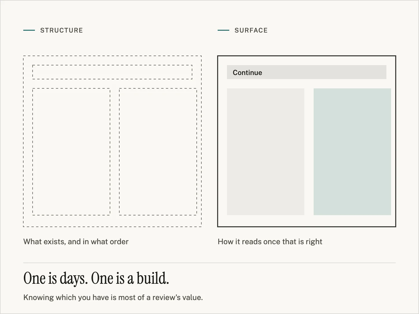
  • Structure — what exists, where it lives, in what order Which screens exist, what belongs on each, what must happen before what, and what a person is expected to already know. Expensive to fix, because the software is built around it.
  • Surface — how it reads once the structure is right Labels, spacing, hierarchy, what is emphasised, what an error says, what a button looks like when it is doing something. Cheaper to change, and frequently enough on its own.
  • Why it matters to your budget A surface problem can often be fixed in days without touching how the software works. A structural one means rebuilding screens. Knowing which you have is most of a review's value.
The same screen twice: on the left a dashed wireframe labelled what exists, and in what order; on the right the finished version with a filled button and one tinted panel, labelled how it reads once that is right. Beneath: one is days, one is a build.

Diagnose it yourself

What the symptom usually means

  • New staff need training to do something obvious

    Structural. The software expects knowledge that lives in someone's head rather than on the screen. Training is the workaround people buy instead of the fix.

  • The same question reaches support every week

    Usually surface, and usually one label or one missing piece of feedback. The cheapest class of fix there is, and the easiest to identify: read your own support inbox.

  • Users keep a spreadsheet next to the system

    Structural, and the most informative symptom on this list. The spreadsheet is a specification — it shows exactly what the software refuses to let people do.

  • The feature exists and nobody finds it

    Either navigation or emphasis. Worth checking before anything is rebuilt, because it is frequently a surface fix being mistaken for a missing feature.

  • People do things in the wrong order and have to start again

    Structural. The sequence the software imposes does not match the sequence the work happens in.

  • It is fine on a laptop and unusable on a phone

    Surface, normally, and sometimes a genuine structural question about whether a phone should be doing that task at all.

What you get

A review of your real screens, not a set of principles
With your data, your roles and your edge cases

We work through the software as your users do — including the screens with the awkward historical data and the role with the odd permissions, because that is where usability actually fails.

What comes back is an annotated walkthrough: each problem shown on the screen it happens on, with what a person is trying to do at that moment and what the interface does instead. No abstractions and no heuristic scores.

How it is ordered

Ranked by how many people hit it, split by what it costs

Problems are ordered by how often they occur across your actual users, not by how much they irritate a designer. A minor annoyance forty people meet daily outranks a serious flaw in a screen used once a quarter.

Then each one is marked cheap or structural. Cheap means a label, a default, a piece of feedback, an order of fields — changeable without touching how the software works. Structural means the screens were built around the wrong shape and the fix is a build.

You can act on the cheap list yourself, with whoever maintains the software. That is a legitimate outcome of the review rather than a failed one.

Honest limits

Redesigning what exists, versus starting again

Two genuinely different pieces of work, and easy to conflate in a brief. The difference is what you are allowed to change.

Working inside what exists

Cheaper, faster, and bounded by decisions someone already made. If the data model will not allow a step to be skipped, no amount of design lets a user skip it. We will say which of your problems are locked in this way.

Starting from the task again

More expensive, and the only route when the sequence itself is wrong. Justified when people are routinely working around the software rather than with it.

What a redesign cannot fix

Missing features, slow software, wrong data, and a process that was broken before it was automated. A pretty interface over any of those makes the problem easier to reach, not smaller.

Doing the cheap list first

Worth considering even when a rebuild is coming. It costs little, it relieves the people using the software now, and it shows which of the expensive problems were really expensive.

Send us the screen people complain about

Describe what someone is trying to do and what happens instead. That is enough to say whether you are looking at a cheap fix or a build.